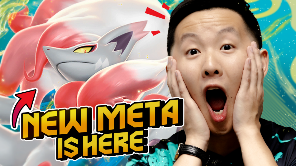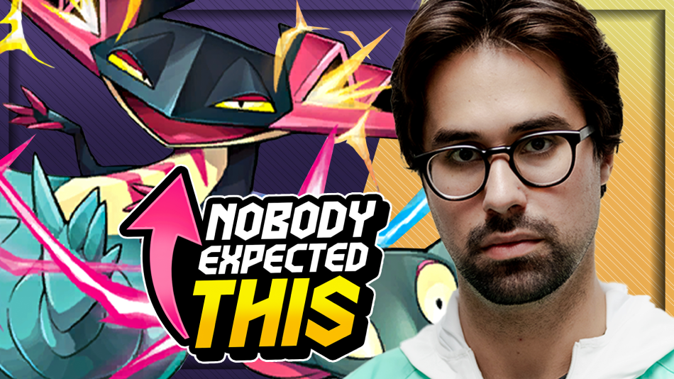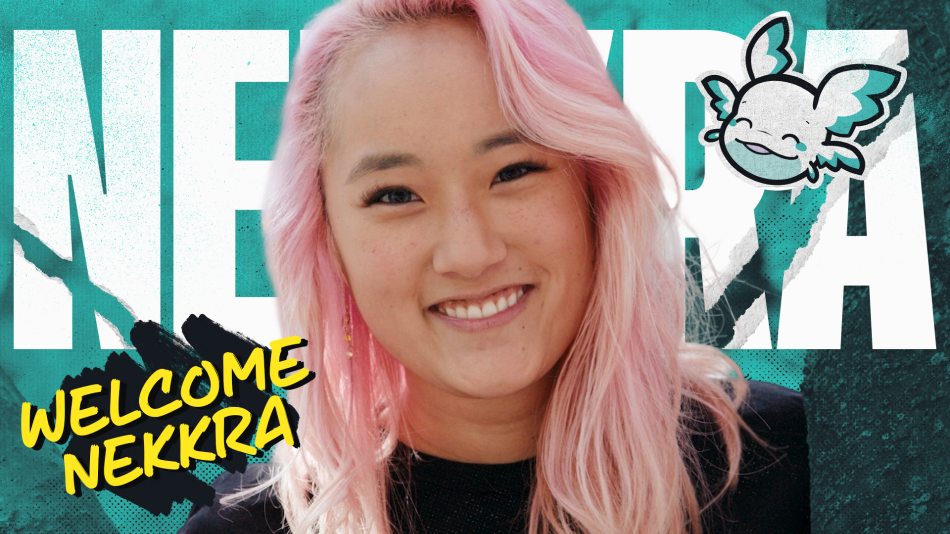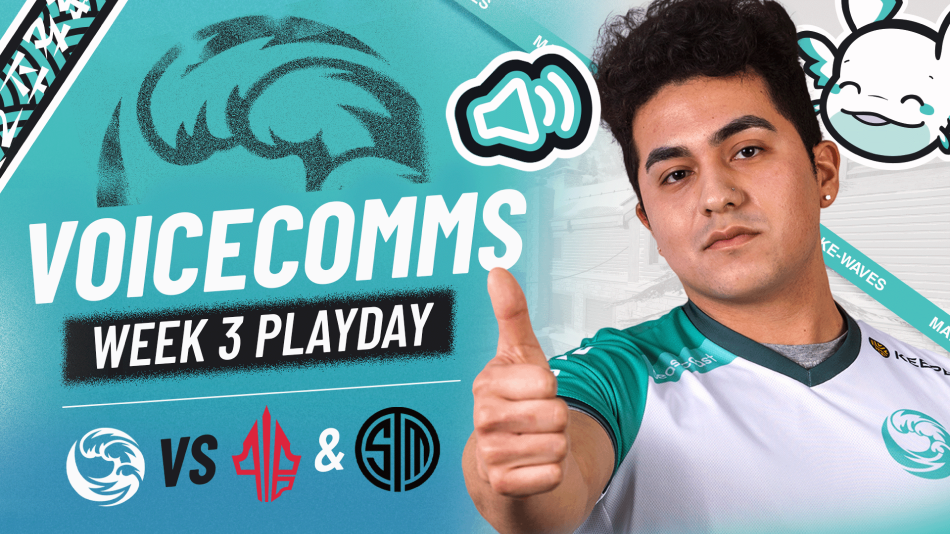
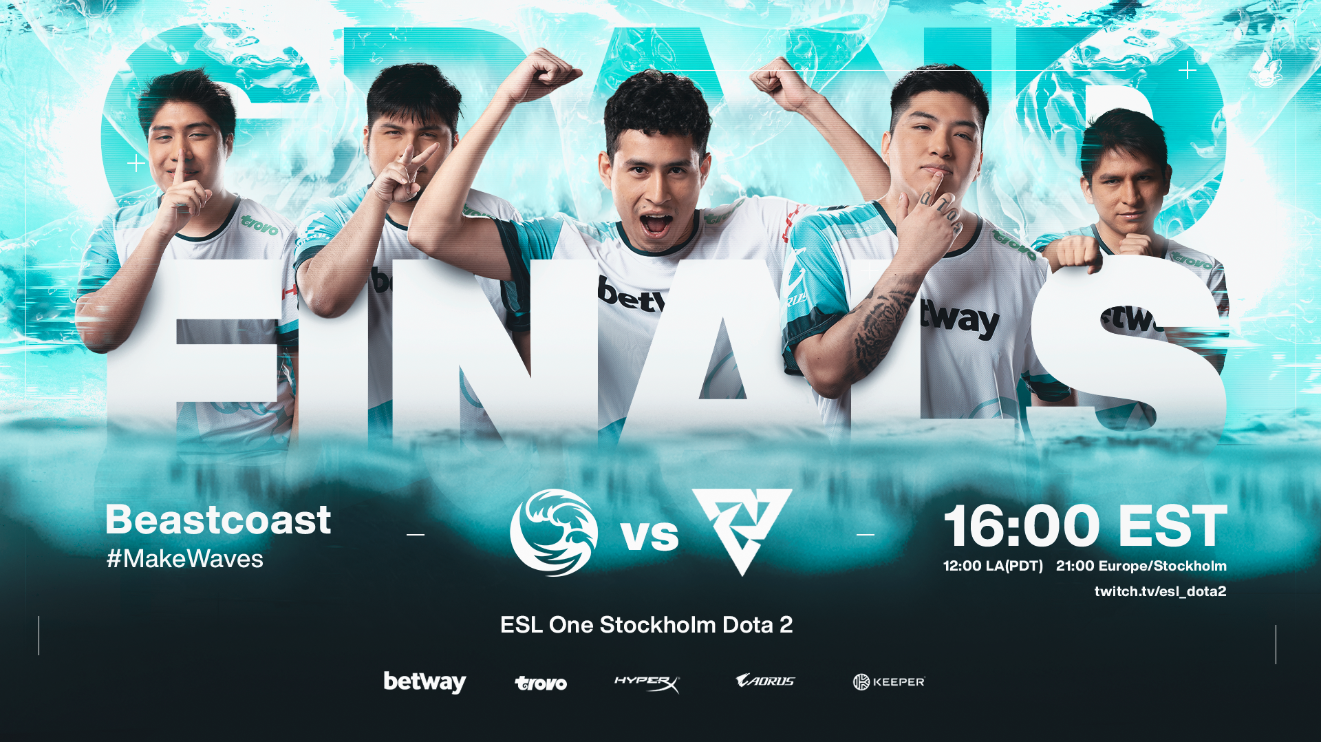
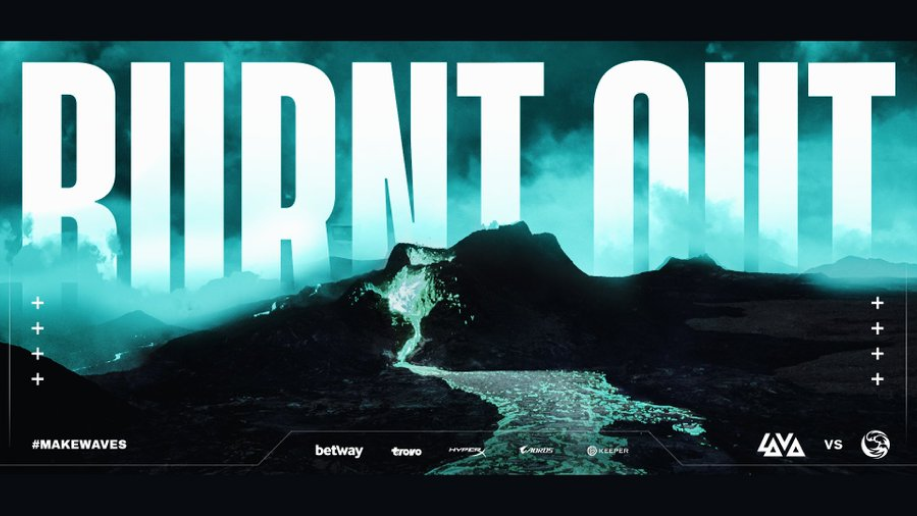
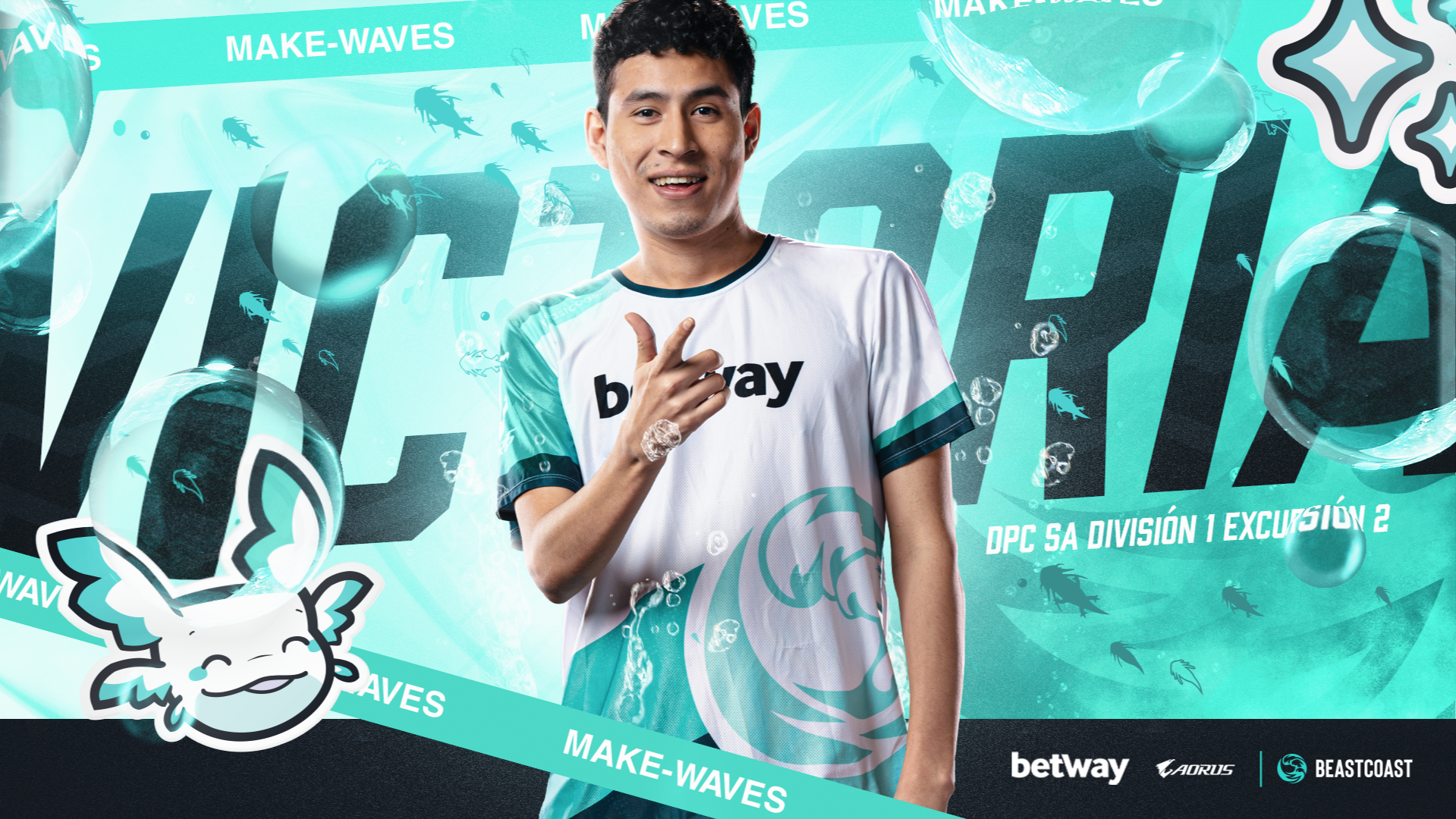
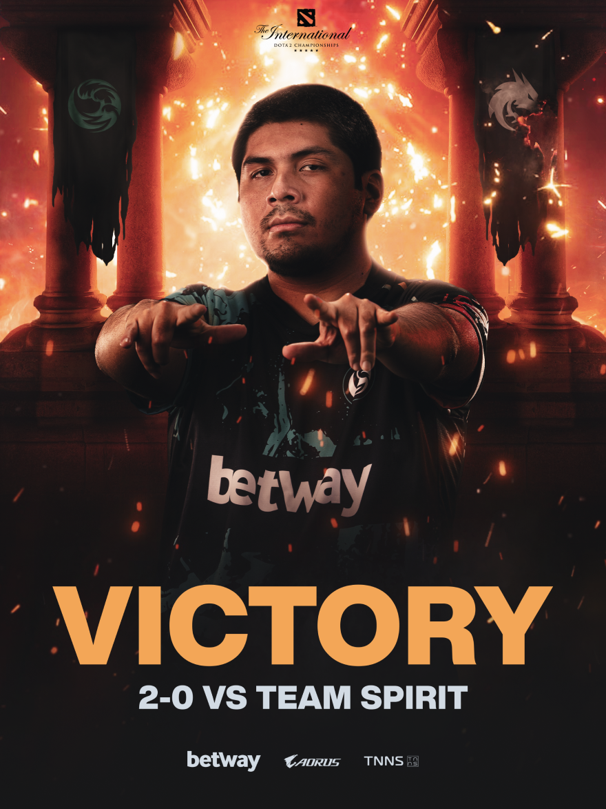
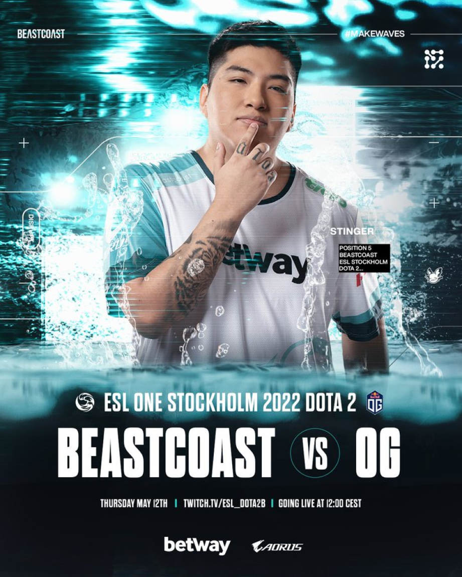
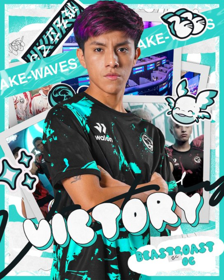
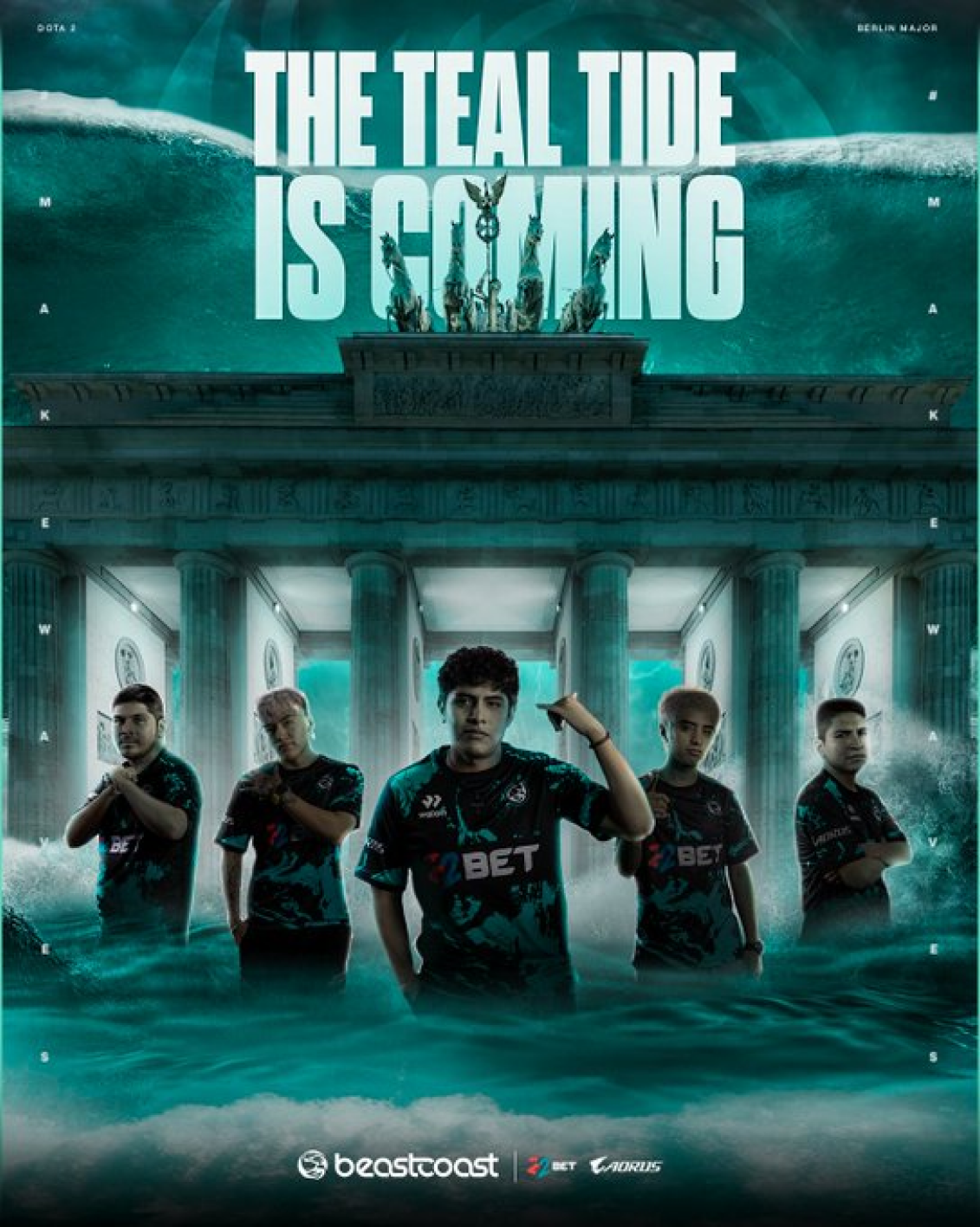
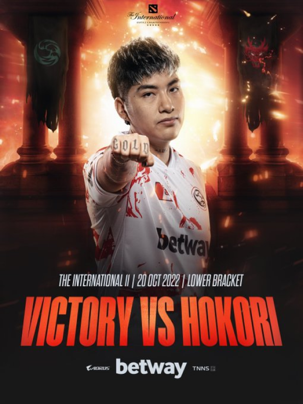
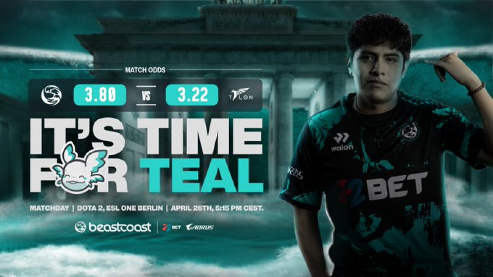
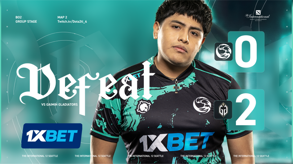
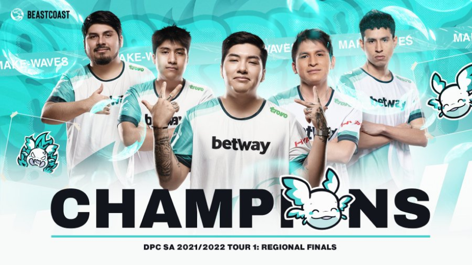
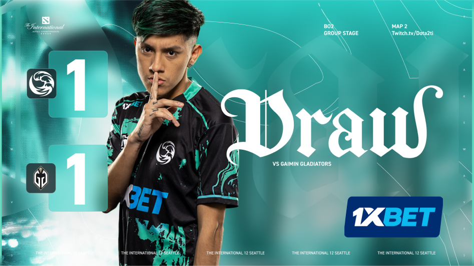
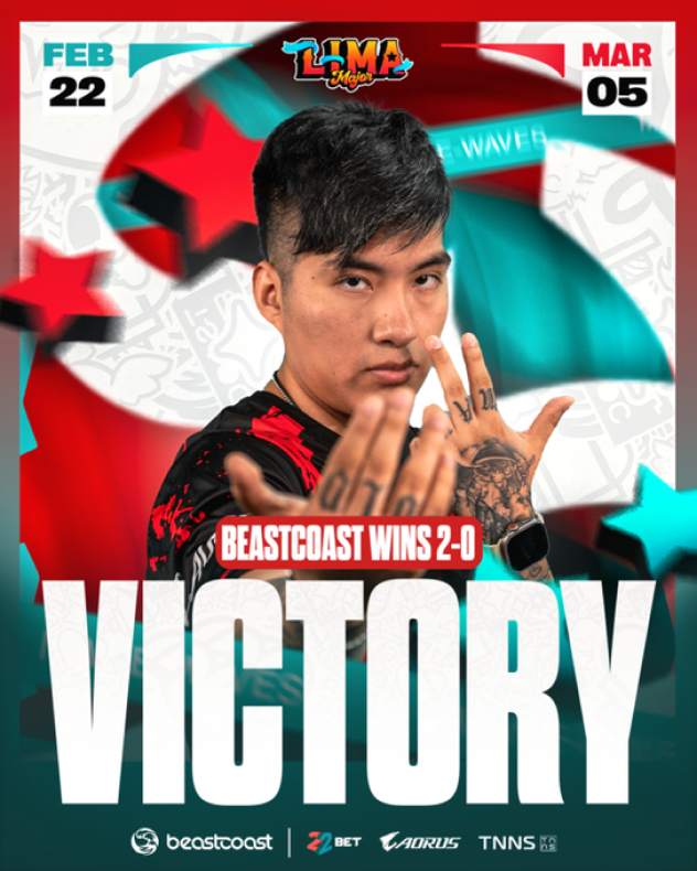
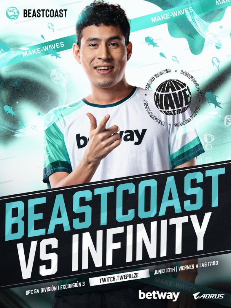
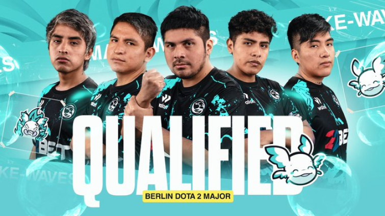
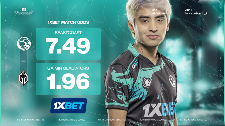
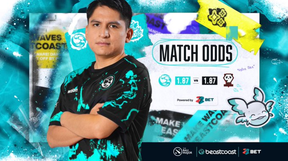
A lot of our Dota 2 roster graphics have varied through out the past 2 years, while trying to keep brand theme and event theme synonymous. IE- The International 12’s theme this past year was a cathedral while we wanted to keep the idea of stained glass and frosted glass elements in the final process. More variations of our Dota 2 graphics are below including The DPC seasons, ESL Stockholm, The Berlin Major, The International 11, The Lima Major, Masters Riyadh and the Bali Major.




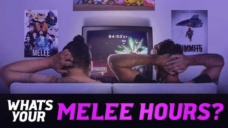
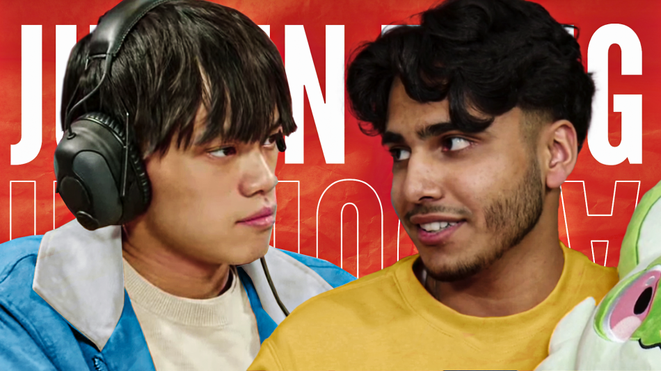
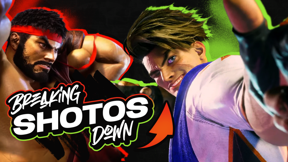
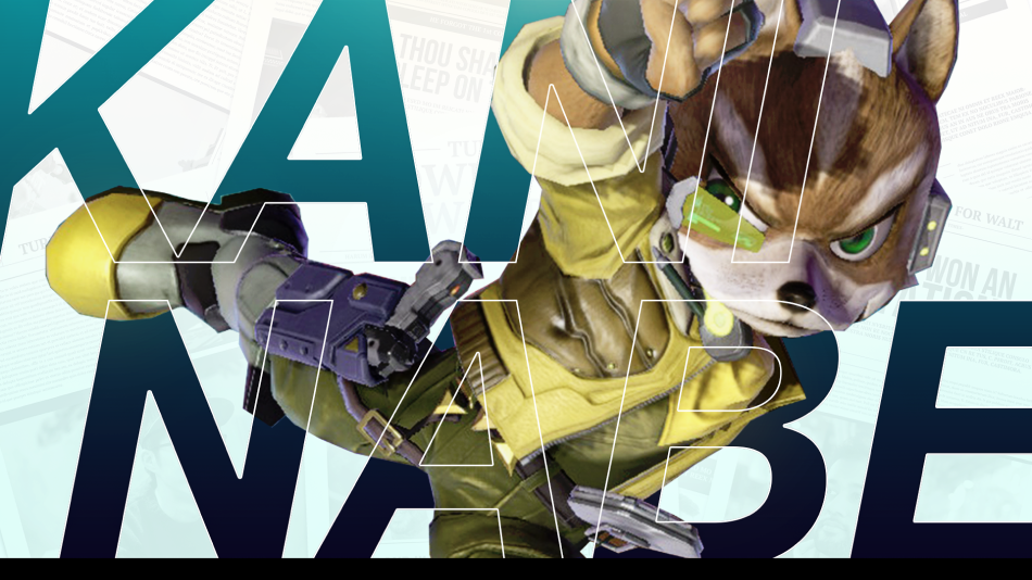
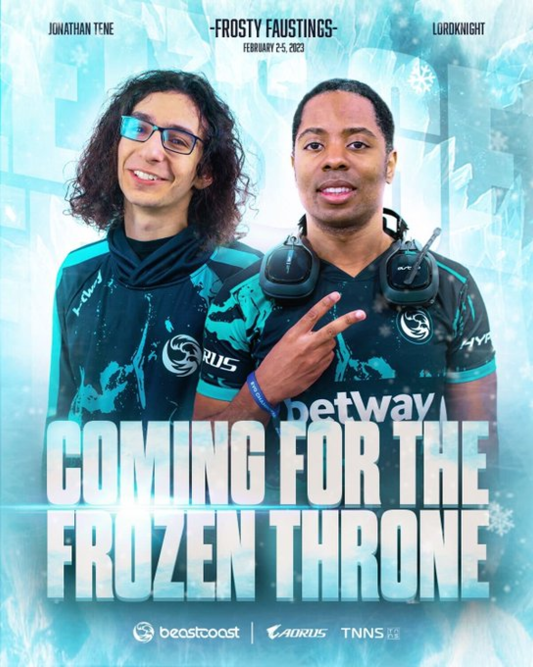
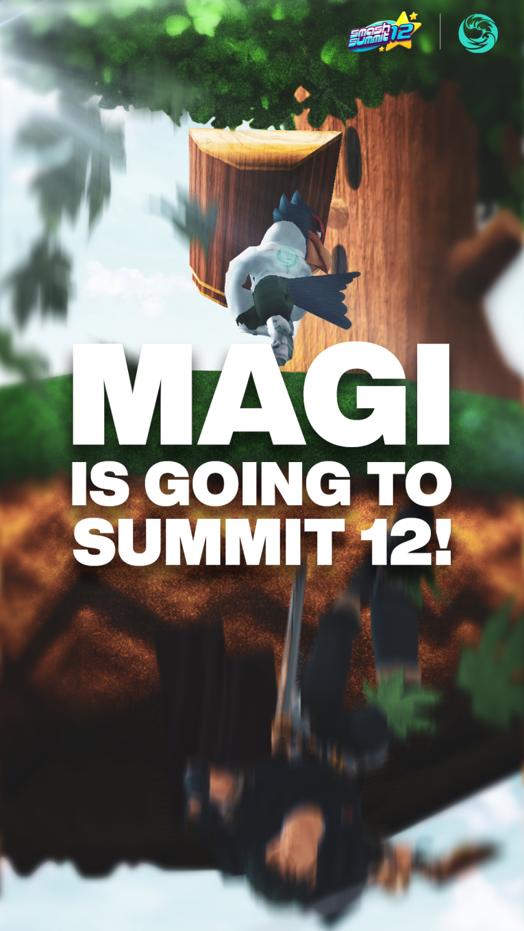
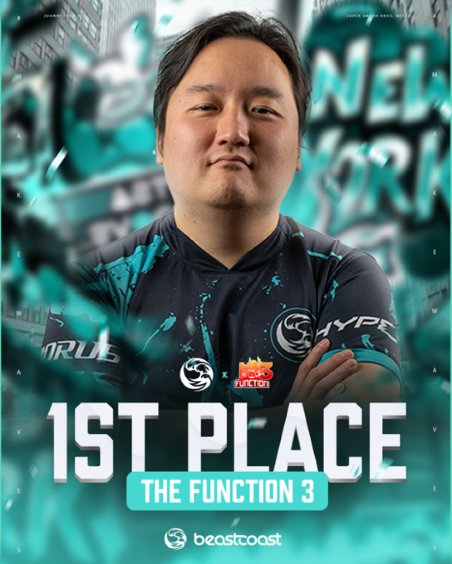
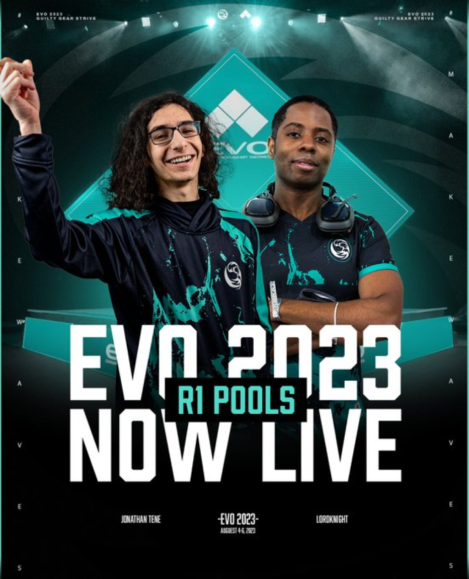
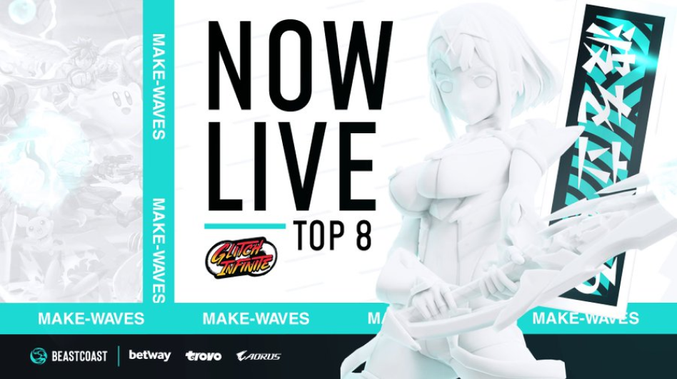
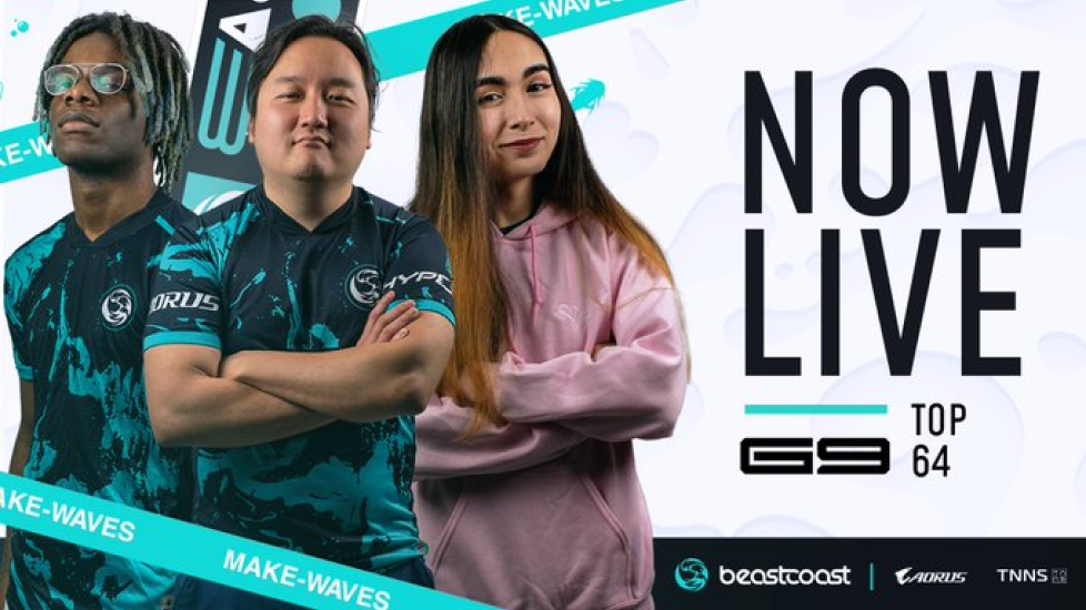
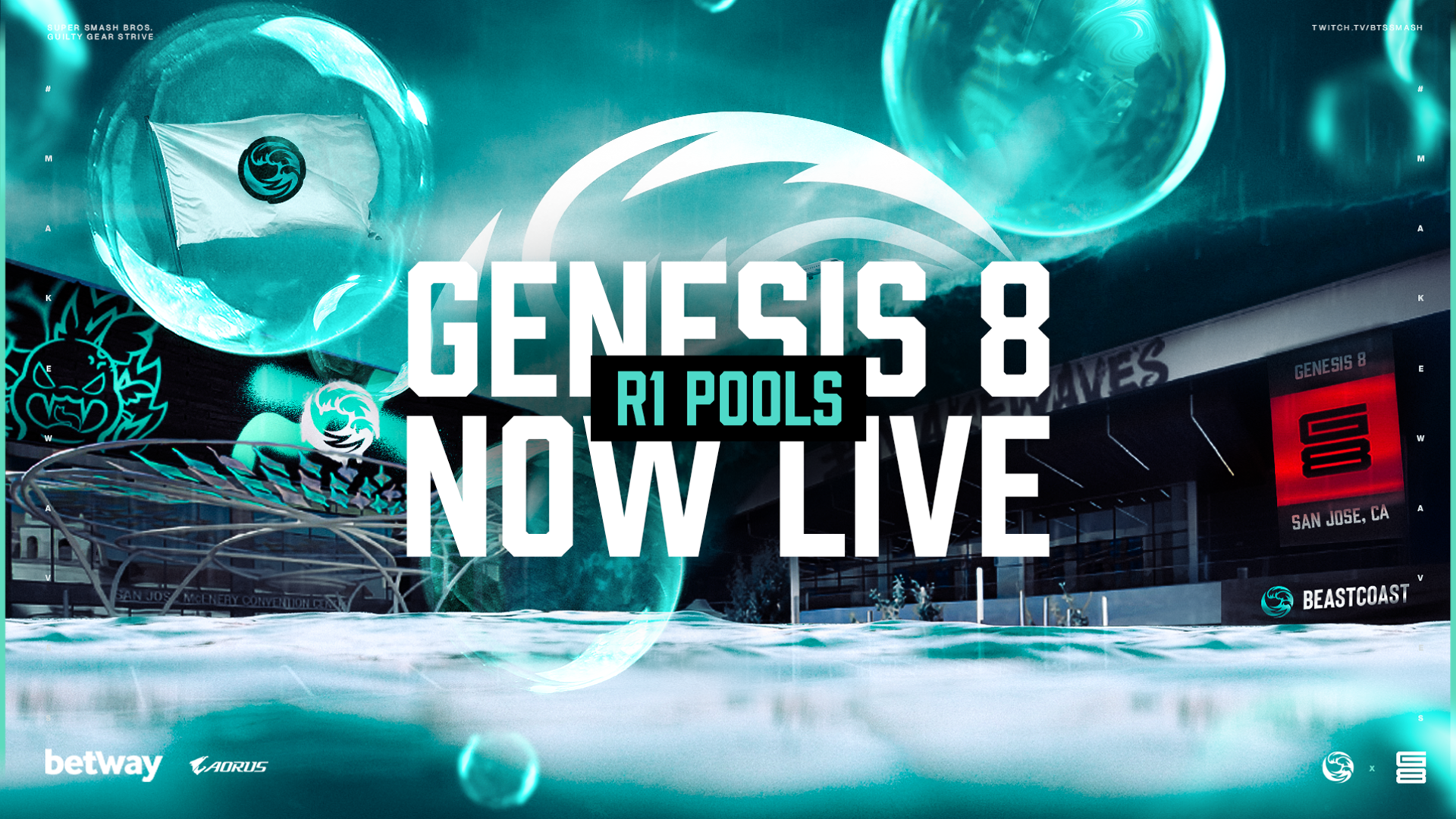
The FGC and Smash Graphics. Honestly my favorite genre of games we compete in, from making event styles graphics such as taking over Genesis 8 where we as a company held our first in person booth at a tournament to myself taking photos of our players during the event because we did not have any of them 💀... That being said we love the FGC and Smash scene and always will.
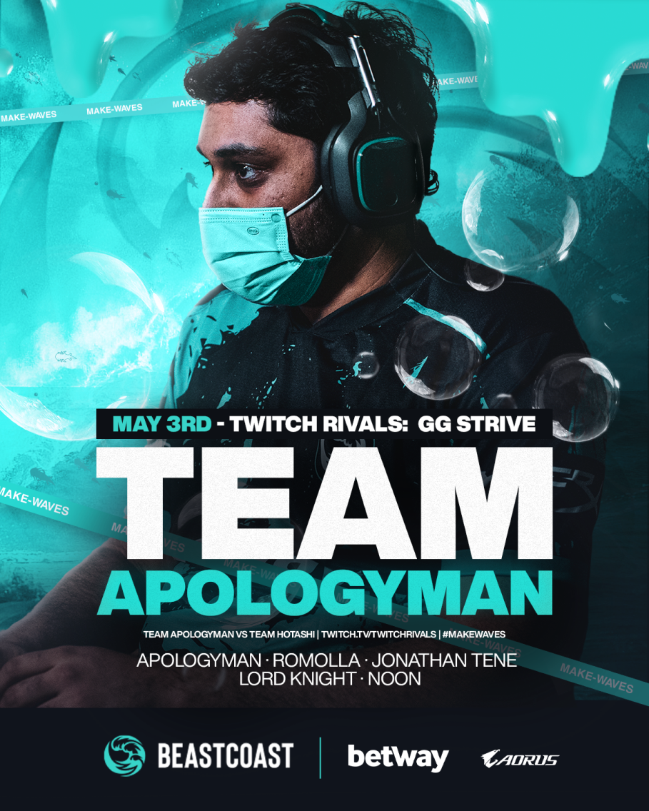
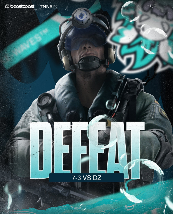
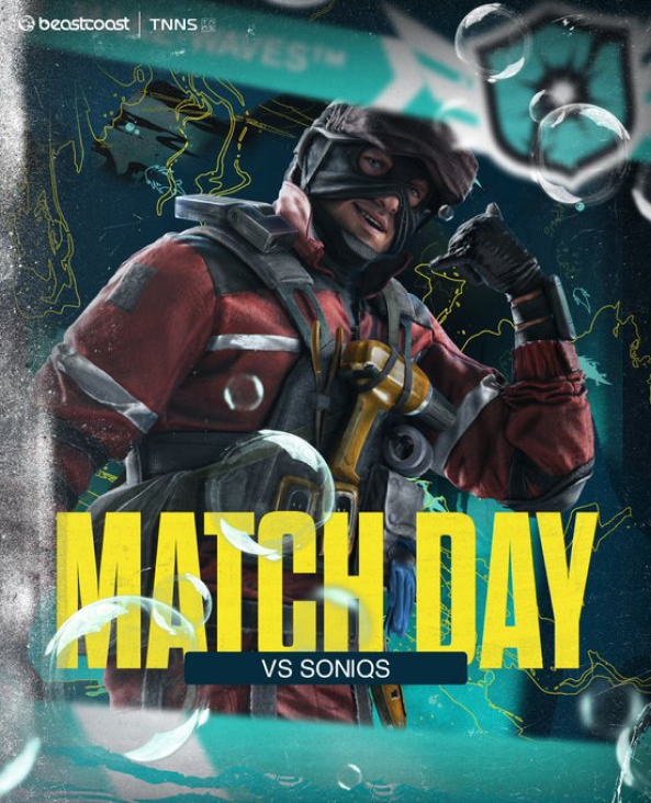
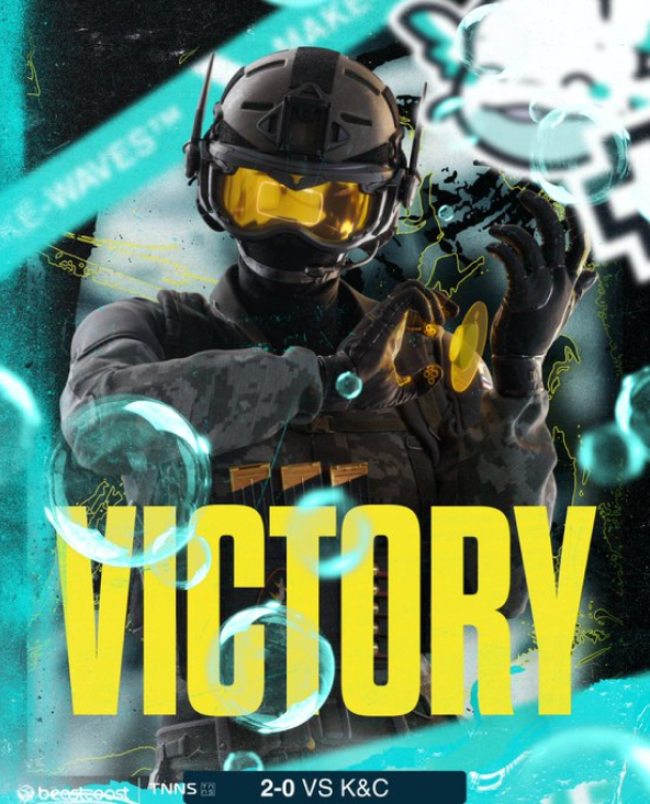
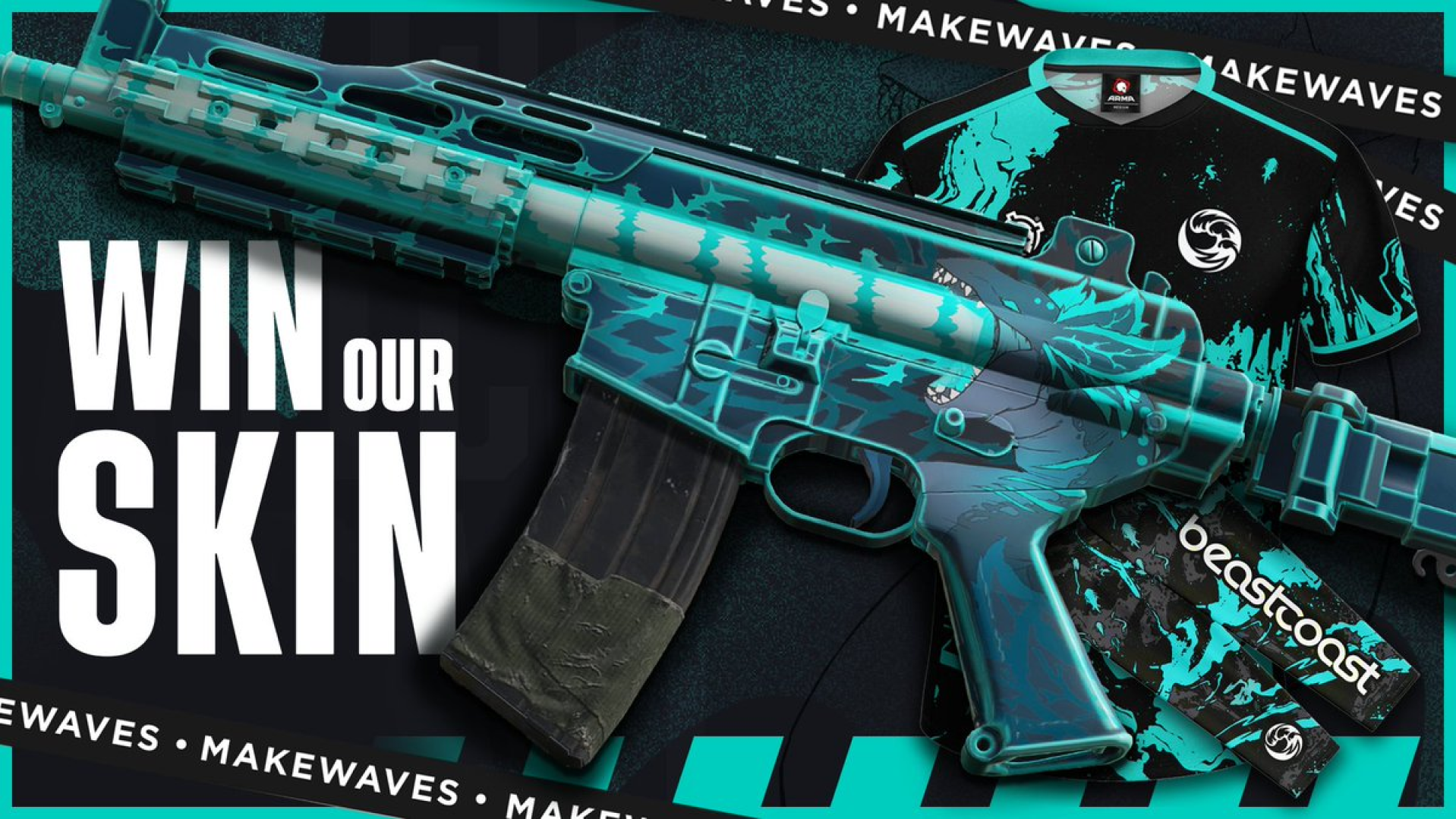
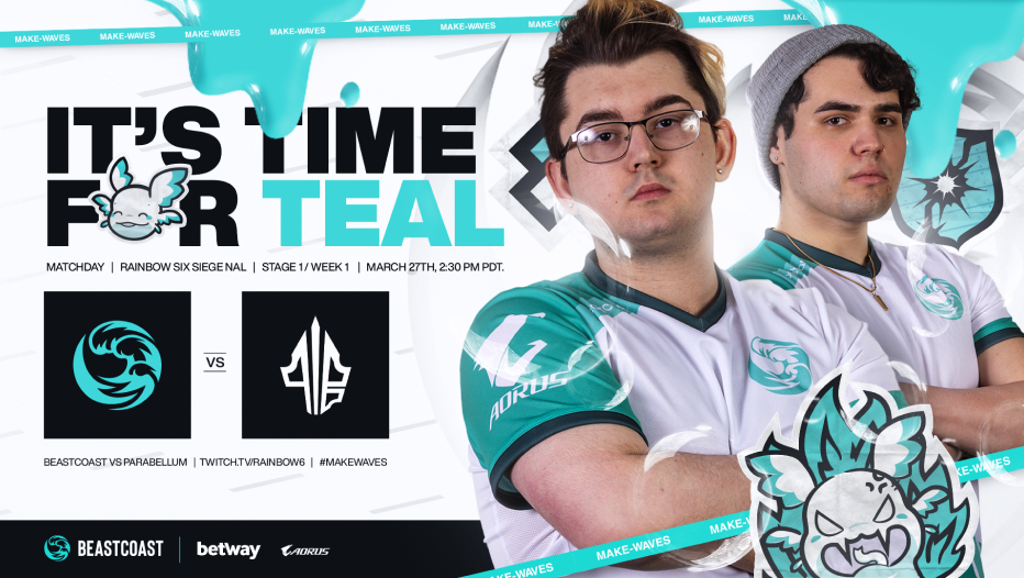
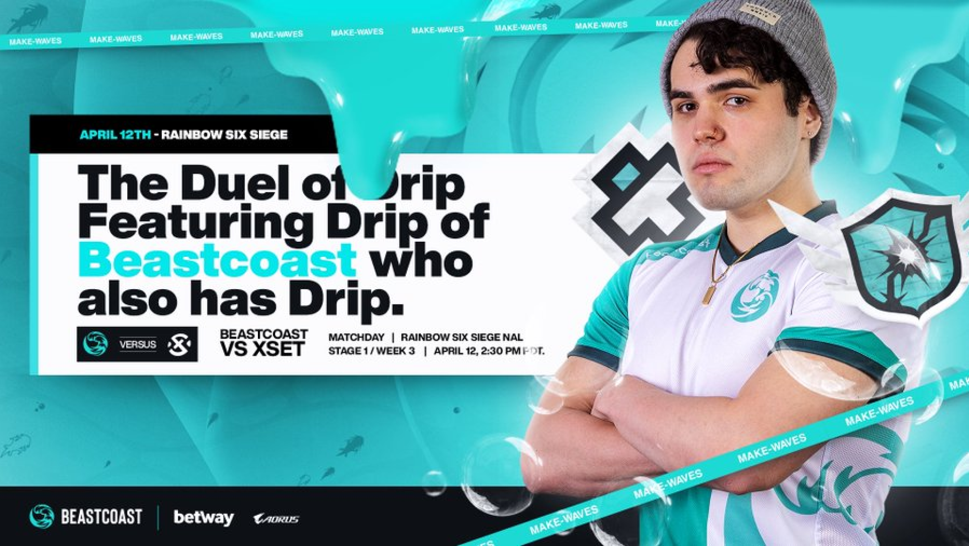
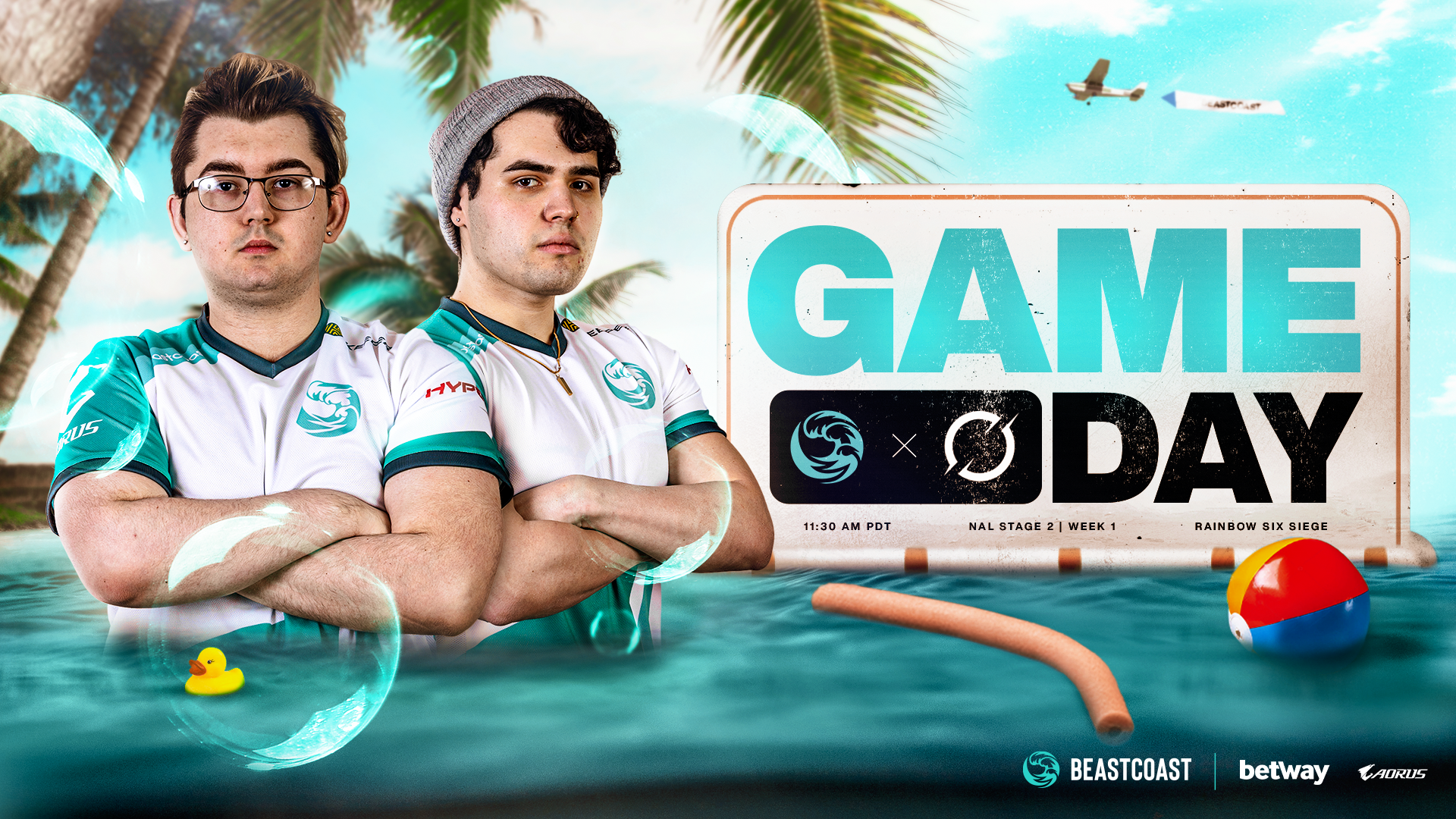
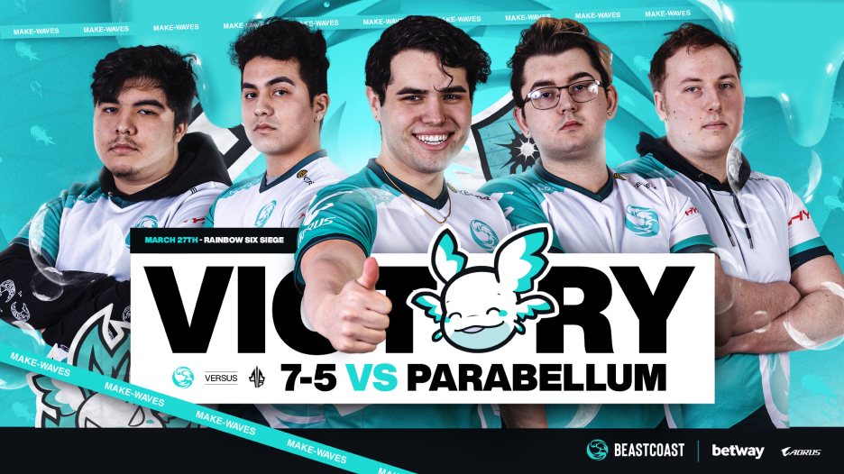
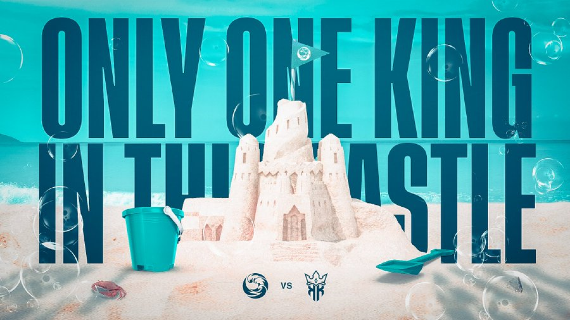
RAINBOW SIX SEIGE. From my unhinged insanity to - my boss telling me please just make a normal graphic, we had a lot of fun shit posting and interacting with the pro scene.
This past Season of the North American League (NAL) we hired a contractor to help produce a more grungy style to show we are down to get dirty and make this season work. Did it work? well ummm sorta... The team might not had performed as expected but hey the graphics still look sick right?
